Here is a number that should make you uncomfortable: over 60% of all web traffic now comes from mobile devices. If your website looks like a desktop site squeezed onto a 6-inch screen, you are actively turning away more than half your potential customers.
And it is not just about looks. Google switched to mobile-first indexing years ago. That means Google judges your site based on the mobile version, not the desktop version. A beautiful desktop site with a broken mobile experience will rank poorly — period.
Let me walk you through 13 fixes that will make your site work properly on every device. No fluff, no theory — just practical changes you can implement this week.
How to Check If Your Site Is Mobile-Friendly
Before fixing anything, confirm the problem:
- Google Mobile-Friendly Test — paste your URL and get a pass/fail result with specific issues
- Chrome DevTools — press F12, click the phone icon, and preview your site on different screen sizes
- Your actual phone — seriously, pull out your phone right now and visit your own site. Tap every button. Fill out every form. Is it frustrating? Then it is frustrating for your customers too.

Fix 1: Add the Viewport Meta Tag
This is the absolute basics, but you would be surprised how many sites miss it. Without this single line of code in your HTML head, mobile browsers will try to render your desktop site at desktop width and zoom out to fit it on screen.
The fix is one line: <meta name="viewport" content="width=device-width, initial-scale=1">
This tells the browser: "Render this page at the actual width of the device." Every responsive design starts here.
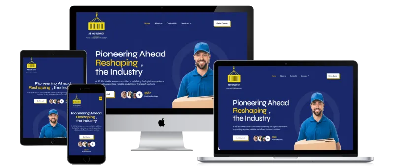
Fix 2: Use Responsive CSS (Not a Separate Mobile Site)
The old approach of building a completely separate mobile site (m.yoursite.com) is dead. It creates duplicate content problems, doubles your maintenance work, and Google hates it.
The modern approach is responsive design — one website that adapts its layout based on screen size using CSS media queries:
- Desktop: 3-column layout, large navigation bar, sidebar
- Tablet: 2-column layout, slightly smaller elements
- Mobile: single column, stacked content, hamburger menu
If your site was not built with responsive CSS, this is probably the biggest change needed. It is worth the investment.
Fix 3: Make Touch Targets Big Enough
Fingers are not mouse cursors. A link that is perfectly clickable with a mouse becomes infuriatingly small on a touchscreen. Google recommends a minimum touch target size of 48x48 pixels with at least 8px of spacing between targets.
The worst offenders:
- Navigation links crammed together
- Tiny "X" buttons on popups
- Social media icons that are too small and too close together
- Footer links with tiny text
Test by actually tapping every interactive element on your phone. If you have to zoom in or tap twice, it is too small.
Fix 4: Implement a Proper Hamburger Menu
Your desktop navigation with 8 menu items and 3 dropdowns cannot simply shrink to mobile width. It needs to collapse into a hamburger menu (those three horizontal lines) that expands when tapped.
Key requirements for a good mobile menu:
- Large, tappable menu items (at least 44px tall)
- Clear visual hierarchy — main items vs sub-items
- A visible close button or tap-outside-to-close
- The menu should not push content down — use an overlay
- Include your CTA (Call, Contact, Book Now) prominently
Fix 5: Optimize Forms for Mobile
If your contact form requires typing a novel on a phone keyboard, people will abandon it. Mobile forms need to be radically simpler than desktop forms.
- Reduce fields to the absolute minimum (name, email/phone, message)
- Use appropriate input types (
type="tel"for phone numbers,type="email"for email) so the right keyboard appears - Make input fields full-width on mobile
- Use large labels above fields, not placeholder text that disappears
- Add autofill support so browsers can fill in common fields
- Make the submit button large and thumb-friendly
Fix 6: Fix Your Font Sizes
If visitors need to pinch-zoom to read your text, you have already lost them. Mobile font sizes should be:
- Body text: minimum 16px (anything smaller forces zoom)
- Headings: 24-32px for h2, scale appropriately
- Line height: 1.5-1.6 for comfortable reading on small screens
- Paragraph width: 65-75 characters per line maximum
Also watch out for text getting cut off or overflowing containers on small screens. Test at 320px width (the smallest common phone width).

Fix 7: Make CTAs Thumb-Friendly
Your call-to-action buttons are the most important interactive elements on your site. On mobile, they need special attention:
- Make them full-width on mobile (easier to tap)
- Place them where thumbs naturally rest (bottom half of the screen)
- Use contrasting colours that stand out on small screens
- Add a sticky CTA bar at the bottom for key actions (Call Now, Get Quote)
- Ensure enough padding around the button (at least 12px)
A "Click to Call" button is pure gold on mobile. One tap and they are calling you. Make it prominent.
Fix 8: Optimize Images for Mobile
Serving a 2000px-wide desktop image to a 375px-wide phone screen is like shipping a dining table when someone ordered a TV tray. It wastes bandwidth and slows everything down.
- Use responsive images with
srcsetto serve appropriately sized images per device - Compress aggressively for mobile — smaller screens are more forgiving of compression artifacts
- Use WebP format with JPEG fallback
- Implement lazy loading so off-screen images do not delay the initial page load
Fix 9: Speed Up Mobile Page Load
Mobile connections are often slower than desktop (especially on cellular data). Everything in our slow website fix guide applies here, but mobile needs extra attention:
- Aim for under 3 seconds on a 4G connection
- Reduce total page weight to under 1.5MB for mobile
- Prioritize above-the-fold content loading first
- Defer all non-essential JavaScript and CSS
- Use a CDN to reduce latency

Fix 10: Handle Popups and Interstitials Properly
Nothing is more infuriating on mobile than a popup that covers the entire screen and has a tiny "X" button you cannot tap. Google will actually penalize your mobile rankings for intrusive interstitials.
If you must use popups on mobile:
- Make the close button large and easy to tap (at least 44x44px)
- Do not trigger them immediately — wait at least 30 seconds or until scroll
- Use a small banner instead of a full-screen takeover
- Never cover more than 30% of the screen
Fix 11: Test on Real Devices
Chrome DevTools is great for quick checks, but it does not catch everything. Real devices have real quirks — different browsers, different OS versions, different screen densities.
At minimum, test on:
- An iPhone (Safari has unique rendering behaviours)
- A mid-range Android phone (not everyone has the latest flagship)
- A tablet in both portrait and landscape
Fix 12: Make Tables Responsive
Tables that work beautifully on desktop become a horizontal scrolling nightmare on mobile. Options:
- Wrap tables in a horizontally scrollable container
- Stack table rows vertically on mobile (each row becomes a card)
- Simplify tables — do you really need all those columns on mobile?
- Use CSS to hide less important columns on small screens
Fix 13: Use Mobile-First CSS
Instead of designing for desktop first and then squeezing it onto mobile, flip the approach. Write your CSS for mobile first, then use min-width media queries to enhance for larger screens.
This approach ensures mobile is never an afterthought. Your base styles work on the smallest screen, and you progressively add complexity for larger ones.
Mobile-Friendly Checklist
| Check | Status | Priority |
|---|---|---|
| Viewport meta tag present | Pass / Fail | Critical |
| Text readable without zooming (16px+ body text) | Pass / Fail | Critical |
| Touch targets 48x48px minimum | Pass / Fail | Critical |
| Hamburger menu works properly | Pass / Fail | High |
| Forms simplified for mobile | Pass / Fail | High |
| Images responsive (srcset) | Pass / Fail | High |
| Page loads under 3 seconds on 4G | Pass / Fail | High |
| No intrusive popups | Pass / Fail | High |
| CTAs are thumb-friendly | Pass / Fail | Medium |
| Tables scroll or stack on mobile | Pass / Fail | Medium |
| Tested on real iPhone and Android | Pass / Fail | Medium |
| Click-to-call button present | Pass / Fail | Medium |
| Mobile-first CSS approach | Pass / Fail | Low |
The Bottom Line
Mobile-friendliness is not a nice-to-have feature in 2026. It is the baseline. If your site does not work flawlessly on a phone, you are invisible to more than half the internet — and increasingly invisible to Google too.
Start with the critical items in the checklist above. The viewport tag, readable text, and tappable buttons will get you 80% of the way there. Then work through the rest methodically.
At TML Agency, we build every website mobile-first from day one. If your existing site needs a mobile overhaul, our dev team can audit your current setup and implement all 13 fixes — usually within a week or two.
Need a mobile-friendly upgrade? Get in touch and we will review your site on every device that matters.